K-pop banner aesthetics are more than just pretty designs they’re a way for fans to express love, pride, and personality through visuals.
Every font, color, and decoration choice tells a story maybe it’s soft and sweet like a spring day, or bold and electrifying like a stadium performance.
From pastel dreamscapes to neon club vibes, K-pop fans have turned banner-making into an art form that blends creativity with fandom culture.
If you’ve been wanting to design one that feels personal, here are 12 detailed K-pop banner aesthetic ideas to inspire your next masterpiece.
1. Pastel Dream
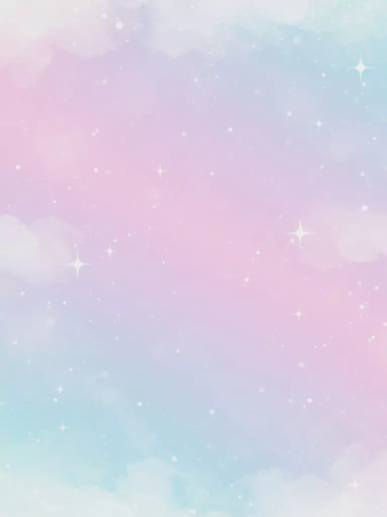
Think soft pinks, baby blues, and gentle lavenders fading into each other. The overall feel is calming and sweet perfect for groups with bright, cheerful concepts.
You could add light sparkles, soft clouds, or doodled stars in the background. Fonts can be bubbly or handwritten for an extra touch of warmth. This style works beautifully for banners that want to say “pure, sweet, and wholesome.”
2. Retro Y2K Pop
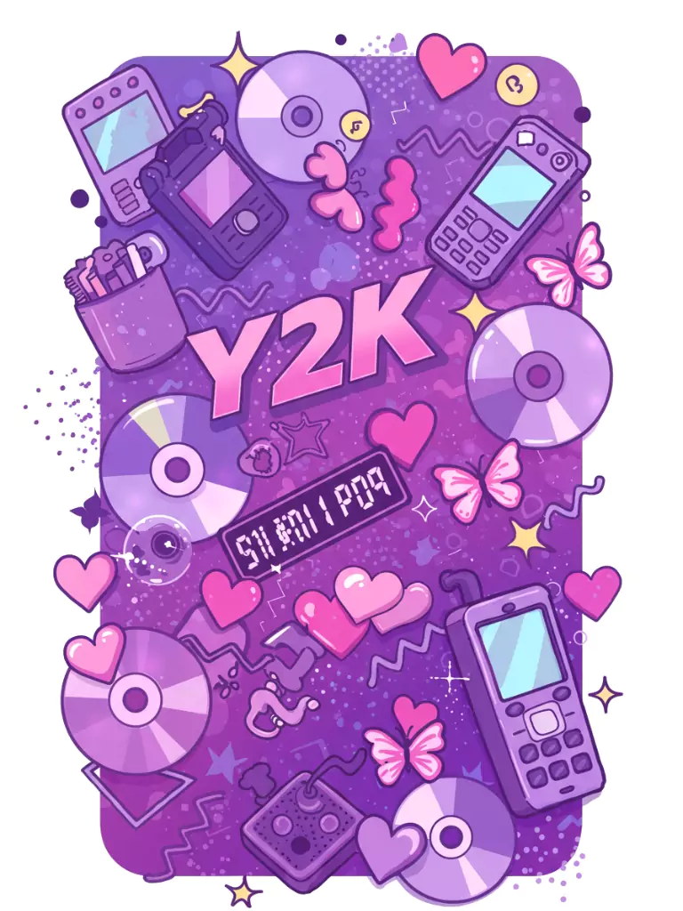
This style is all about shiny gradients, pixel hearts, and bubble letters that look like they came straight out of the early 2000s. Imagine metallic purples, lime greens, and neon pinks layered with cute shapes like CDs, flip phones, and digital butterflies.
It’s fun, nostalgic, and works especially well for banners celebrating throwback eras or playful, energetic comebacks.
3. Minimalist Monochrome
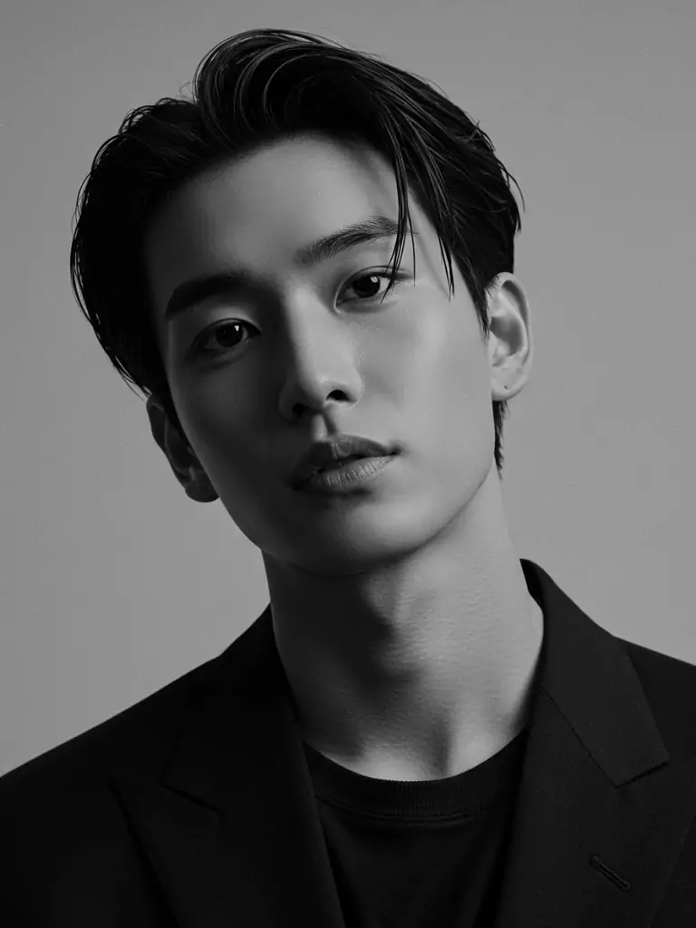
For fans who want something sleek and timeless, a monochrome palette is perfect.
Pick one color like deep navy, muted beige, or classic black and white and keep the design clean. Use bold, simple fonts and let one striking photo of your idol take center stage.
The absence of clutter makes it look professional and modern, like a fashion campaign.
4. Collage Montage
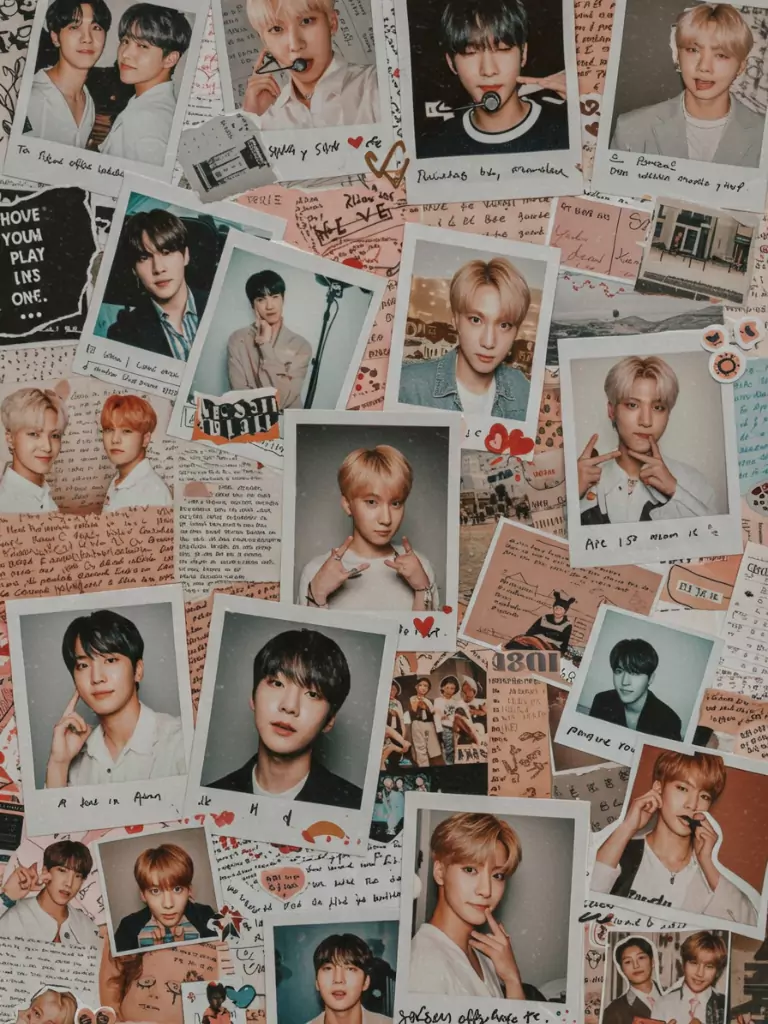
This is the scrapbook lover’s dream. Mix and match polaroid-style member photos, handwritten lyric snippets, torn paper textures, and sticker cutouts.
Each element feels personal, as if you’re making a fan diary on a banner. This style is great for showing multiple sides of your bias or highlighting every member in a group.
5. Retro Film Aesthetic
Add film grain, warm tones, and vintage borders to make your banner feel like it came from an old photo roll. You can use candid photos of idols, faded text, and sepia or black-and-white filters.
This aesthetic works well for groups with a mature or nostalgic vibe, giving the banner a timeless charm.
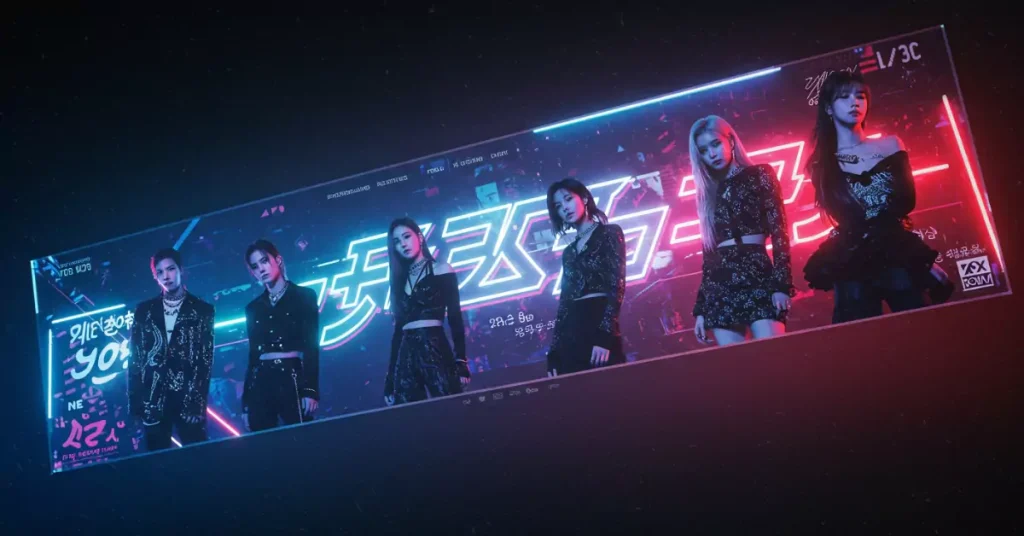
6. Gradient Neon Glow
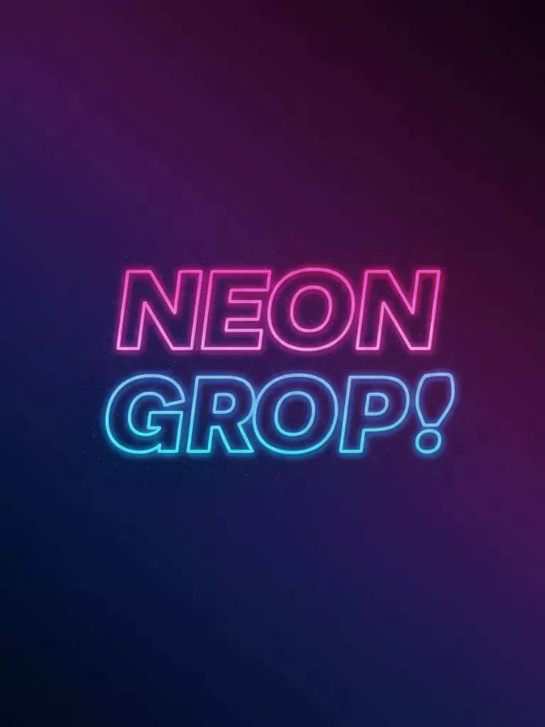
If you want your banner to pop instantly, go for neon text glowing against a dark or gradient background.
Think hot pinks fading into purples, electric blues melting into neon greens, and thick text with a glowing edge. It’s bold, powerful, and perfect for groups known for high-energy performances.
7. Handwritten Coquette Style
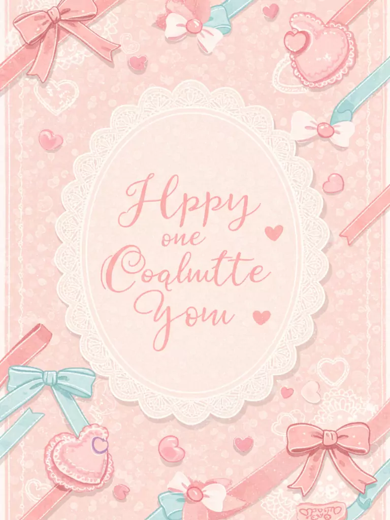
This aesthetic feels sweet and romantic. Imagine soft pastel backgrounds decorated with ribbon bows, lace textures, and heart doodles.
The fonts are delicate cursive or neat handwriting, giving it a personal love-letter feel. It’s perfect for fan-made birthday banners or messages of affection to a bias.
8. Sticker & Icon Clusters
This one is playful and fun scatter little icons like hearts, sparkles, stars, flowers, or even mini fandom lightsticks around your main image.
The background can be plain or pastel, letting the stickers act as colorful accents. It feels lively and cute, almost like decorating a diary page in digital form.
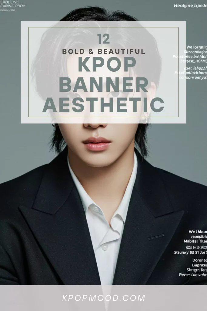
9. Headline Magazine Cover
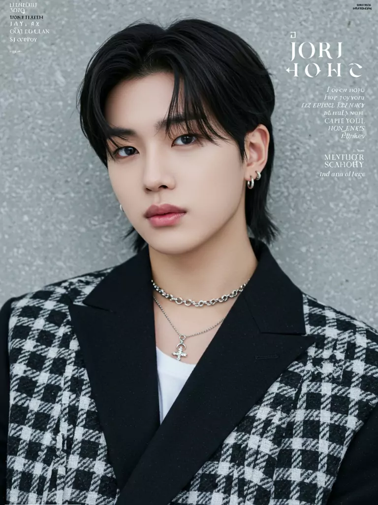
Make your banner look like the front page of a high-fashion magazine. Use one central, high-quality idol photo, then layer big bold title text, smaller subheaders, and maybe a subtle textured background.
It gives off a classy, editorial vibe—perfect for showcasing idols who have strong model-like visuals.
10. Concert-Style Slogan Banner
Just like the banners you see at live shows, this style focuses on one big, bold message like a fan chant or bias name across the center. Backgrounds can be group photos, fandom colors, or even a simple gradient.
This design is ideal if you plan to print it for events or share it online during comeback days.
11. Text-Only Typography
Sometimes, words are all you need. This aesthetic relies on font choice, color contrast, and layout to grab attention.
You can mix big bold letters with smaller cursive lines, tilt words for a dynamic look, or stack them in creative ways. Without images, it’s clean but still expressive.
12. Photo Slice Layout
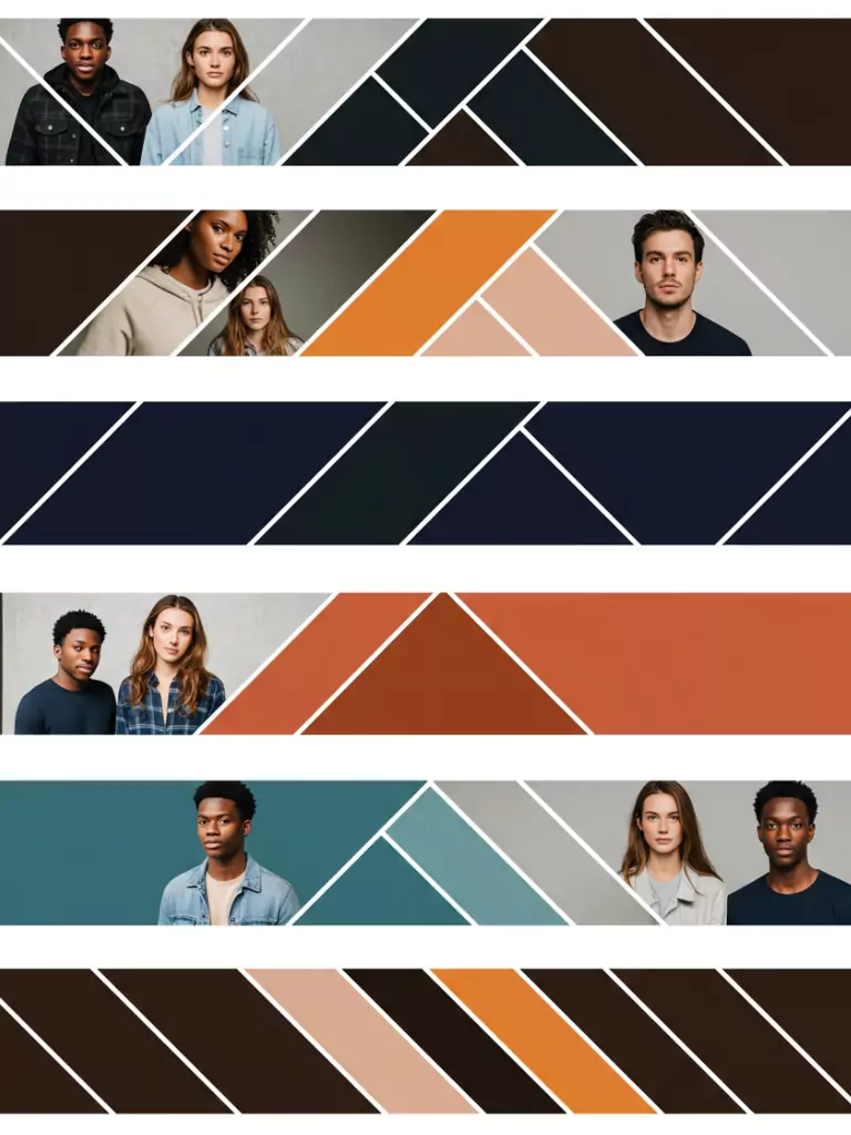
Divide your banner into sections horizontal stripes, vertical columns, or angled shapes and put different images or colors in each.
For a group banner, you can give each member their own slice while keeping the colors and style consistent so it feels unified. This layout is organized yet visually interesting.
Which K-pop Banner Aesthetic Matches Your Style?
Your K-pop Banner Aesthetic Is:
Conclusion
A great K-pop banner isn’t just decoration it’s a small piece of your fandom identity. Whether you go soft and pastel, bold and neon, or sleek and minimal, each design choice helps show off your love for your idols in a way that’s unique to you.
These 12 ideas are just starting points mix them, experiment, and let your creativity shine. The most important part? Have fun with it, and let your banner feel like a little piece of your K-pop heart.