When I first started exploring fashion design, I quickly realized that color isn’t just about making things look pretty it’s about creating a mood, telling a story, and even influencing how people perceive a brand or outfit.
That’s where color theory comes in. Understanding it can completely change the way you approach your wardrobe or design your own collections.
Today, I’ll walk you through everything you need to know about using color theory in fashion design, step by step.
Introduction to Color Theory
What is color theory?
Color theory is the study of how colors interact with each other and how they affect human perception. In fashion, it’s about choosing colors that complement each other, evoke certain feelings, and make a design look balanced and intentional.
Why color matters in fashion design
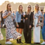
Color has a huge impact on the overall impression of an outfit or collection. The right colors can highlight your best features, evoke a mood, or even tell a story. Designers use color to create identity, connect with audiences, and make their pieces memorable.
The benefits:
- Mood: Colors can make people feel calm, excited, confident, or cozy.
- Identity: A consistent color palette can define your style or brand.
- Market appeal: Fashion that looks harmonious is more likely to attract buyers.
Foundations of Color Theory
Before you dive into designing, it’s important to understand the building blocks of color.
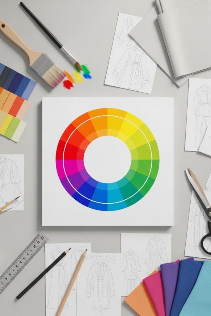
The Color Wheel: Primary, Secondary, Tertiary
The color wheel is your best friend in fashion design. The primary colors are red, blue, and yellow. Mix them, and you get secondary colors like green, orange, and purple. Mixing those further gives you tertiary colors, which are all the shades in between. The wheel helps you see which colors naturally work well together.
Hue, Saturation & Value Explained
- Hue: The basic color itself (like red or blue).
- Saturation: How intense or muted the color is. A bright red is high saturation, while a dusty pink is low.
- Value: How light or dark the color is. This is important for creating contrast in outfits.
Warm vs. Cool Colors & Their Fashion Impacts
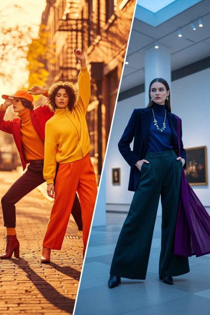
- Warm colors (reds, oranges, yellows) are energetic and attention-grabbing.
- Cool colors (blues, greens, purples) feel calm and sophisticated.
Knowing which colors are warm or cool can help you decide the mood of your outfit or collection.
Color Harmony & Schemes for Outfit Design
Once you know the basics, you can start combining colors thoughtfully.
Monochromatic Palettes
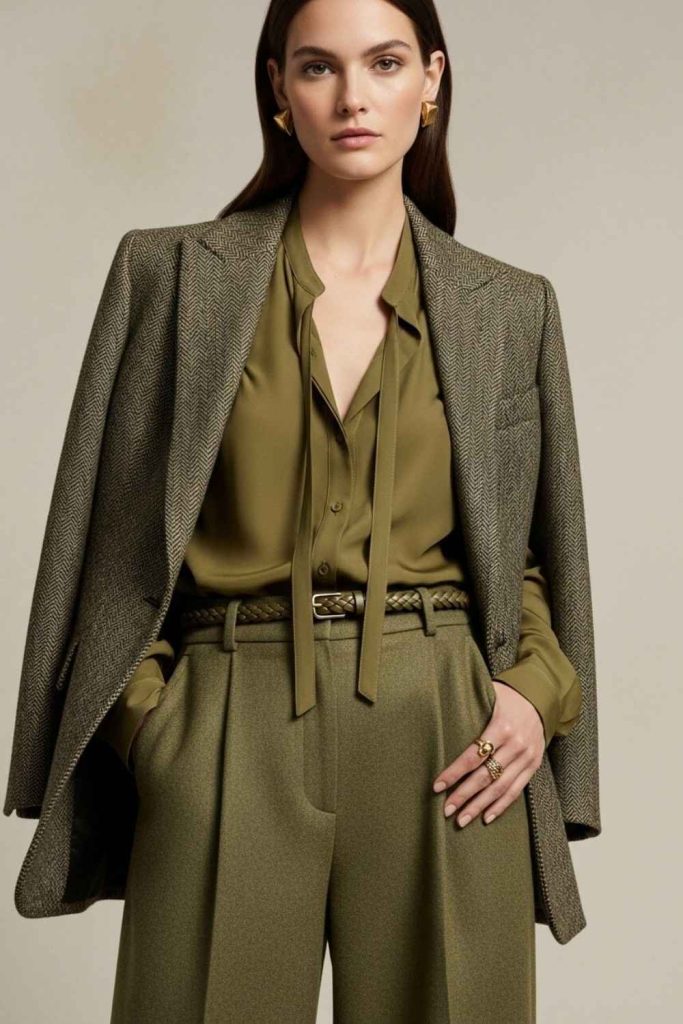
Using different shades, tints, and tones of a single color creates a cohesive and elegant look. It’s subtle but sophisticated.
Analogous Combinations
These are colors that sit next to each other on the color wheel, like blue, teal, and green. They’re harmonious and easy to wear.
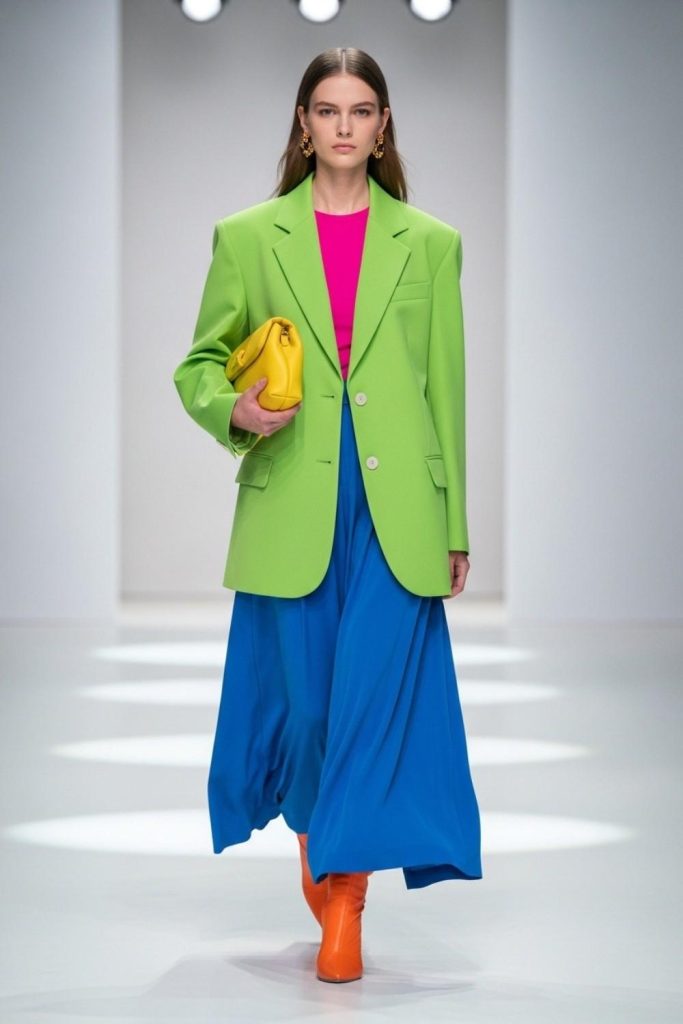
Complementary & Triadic Schemes
- Complementary: Colors opposite each other on the wheel, like red and green. They create strong contrast and make outfits pop.
- Triadic: Three colors evenly spaced on the wheel, like red, yellow, and blue. This creates a balanced yet vibrant look.
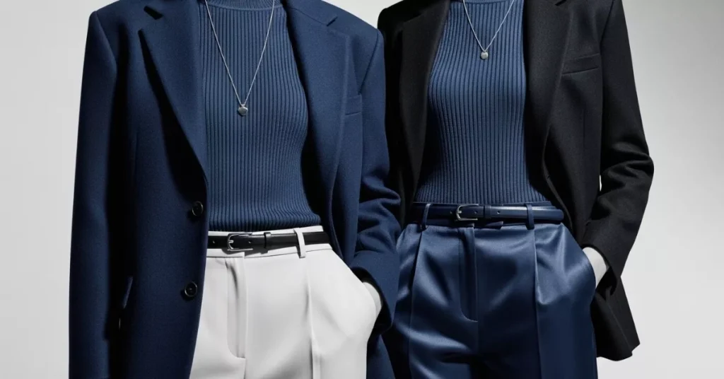
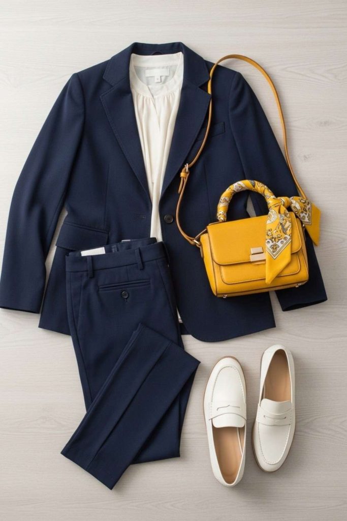
Using Neutrals as Anchors
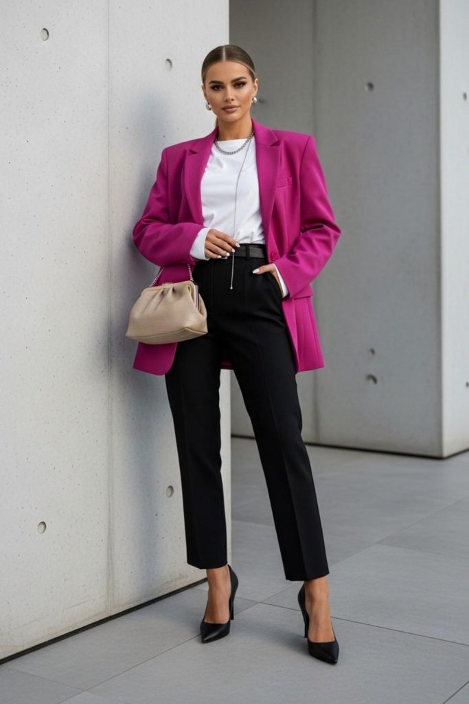
Neutrals like black, white, gray, and beige help balance bold colors. They can anchor a bright outfit so it doesn’t feel overwhelming.
Psychological Effects of Fashion Colors
Colors aren’t just visual they convey emotions and tell stories.
- Red: Confident, bold, passionate
- Blue: Calm, professional, trustworthy
- Green: Fresh, natural, balanced
- Yellow: Cheerful, optimistic, playful
- Purple: Creative, luxurious, mysterious
By understanding these associations, you can design outfits that evoke the exact mood you want, whether it’s playful, serious, or romantic.
Practical Rules for Fashion Combinations
Knowing theory is one thing, but applying it is where the magic happens.
The 60‑30‑10 Rule for Balanced Outfits
The 60-30-10 rule is a simple way I use to keep outfits looking balanced and intentional.
One main color takes up about 60% of the outfit, a secondary color covers 30%, and a bold accent color is used for the remaining 10% to add interest without overwhelming the look.
The “3‑Color Principle” for Clear Styling
The 3-Color Principle helps keep your outfit looking clean and intentional. By limiting your look to three main colors, everything feels balanced and easy on the eyes, instead of messy or overwhelming.
Using more than three colors can still work, but it needs strong planning and confidence. When done without intention, too many colors can clash and distract from the overall style instead of enhancing it.
Mix vs. Match: When to Break Rules
Rules in color theory are meant to guide you, not restrict your creativity.
Once you understand how colors normally work together, you can confidently mix unexpected shades and break the rules to create bold, eye-catching fashion statements that feel intentional rather than random.
Aligning Colors with Skin Tones and Body Types
Your colors should enhance your natural features.
- Warm undertones: Opt for earthy colors like mustard, olive, coral
- Cool undertones: Go for jewel tones like sapphire, emerald, or lavender
The right palette can make your skin glow, your eyes pop, and your overall look more cohesive.
Seasonal & Trend‑Driven Color Strategy
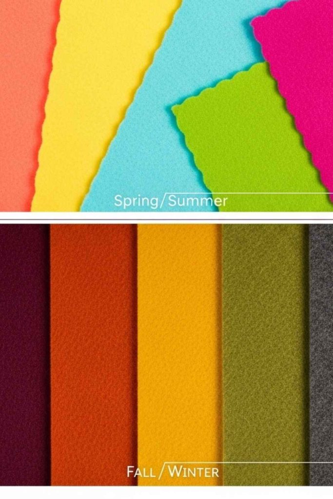
Fashion trends change every season, and so do colors. Designers forecast trends to keep collections fresh. For example:
- Spring/Summer: Bright, energetic hues
- Fall/Winter: Warm, muted tones
Knowing seasonal trends helps you stay relevant while still applying solid color theory.
Color Theory in Collection Development
When designing a collection, I always start with a moodboard. This includes:
- Palette libraries with primary and accent colors
- Fabric swatches to see how color changes on different materials
- Testing combinations before production
This method ensures that every piece in the collection feels cohesive and intentional.
Case Studies from Iconic Designers
Some of my favorite designers have mastered color use:
- Coco Chanel: Monochromatic palettes and classic neutrals
- Alexander McQueen: Bold complementary colors for drama
- Ralph Lauren: Seasonal color storytelling that feels effortless
Studying their work shows how color theory is applied in real-world fashion.
Conclusion
Color theory in fashion isn’t just for designers it’s for anyone who wants to dress thoughtfully, design intentionally, or build a cohesive wardrobe.
By understanding the wheel, harmonies, psychological effects, and practical rules, you can make your outfits or collections look polished, balanced, and full of personality