
Have you ever flipped over a K-Pop photocard and felt a rush of excitement from its unique design? Or maybe you’ve dreamed of creating your own card to capture that special fandom vibe?
If you’re passionate about K-Pop and love collecting or designing photocards, you’re in the right place! Crafting the perfect photocard back is an art, but with a bit of creativity, it’s totally doable.
We’ve put together 16 simple yet inspiring K-Pop photocard back design ideas to spark your imagination. Let’s dive in and explore these designs, each blending style, purpose, and fan connection, perfect for your next collection or DIY project.
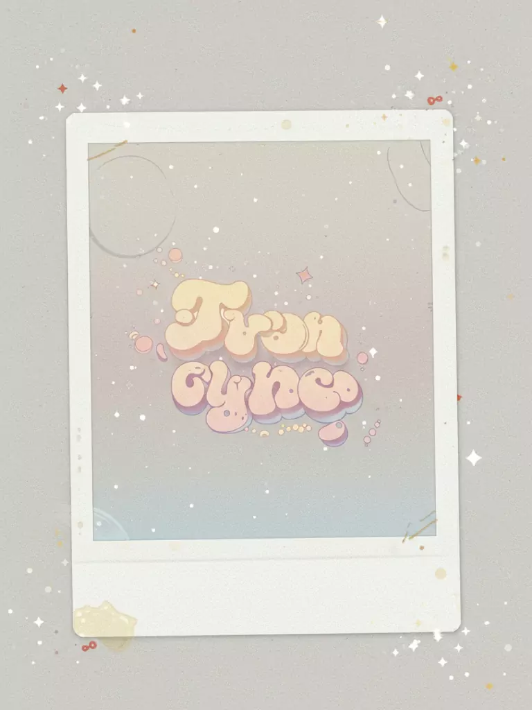
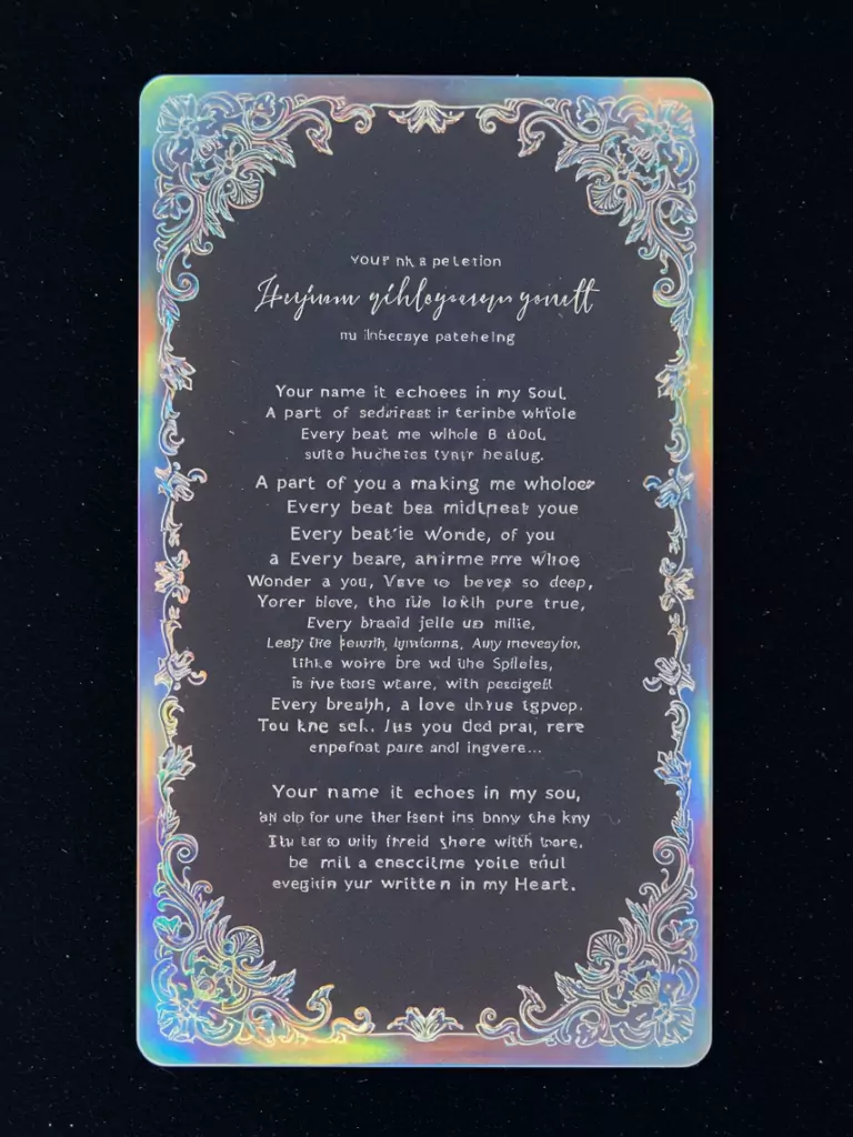
1. Holographic Album Logo with Gradient
Picture flipping over a photocard and seeing a holographic background that sparkles as you tilt it. The group’s logo sits in the center, blending smoothly into a gradient that matches the album’s color scheme, like warm sunset oranges for a cozy vibe or cool night blues for a calm mood.
This design is a favorite among collectors because it looks premium and grabs attention. The holographic effect adds a touch of luxury, while the gradient keeps it fresh and tied to the album’s theme, making it ideal for fans who want a card as vibrant as the music.
2. Handwritten-Style Signature

A photocard with a handwritten-style signature on the back feels personal and meaningful. Placed on a plain white or black background, the idol’s name is written in a flowing font that looks authentic, creating a sense of closeness.
This simple design lets the signature shine, appealing to fans who want to feel connected to their idols. It works well for any group or concept, from upbeat to soulful, and collectors value it for its emotional depth and classic style.
3. Thematic Symbol Pattern

A repeating pattern of symbols linked to an album’s theme, such as stars for a space concept or hearts for a romantic one, creates a unified and attractive back design.
This approach connects the photocard to the group’s story, whether it’s a dreamy or playful narrative. The pattern is subtle enough to not overwhelm the card yet distinct enough to be recognizable. Fans enjoy this design because it tells a story, making it essential for collectors who love album-specific details.
4. Glitter-Infused Minimalist Design
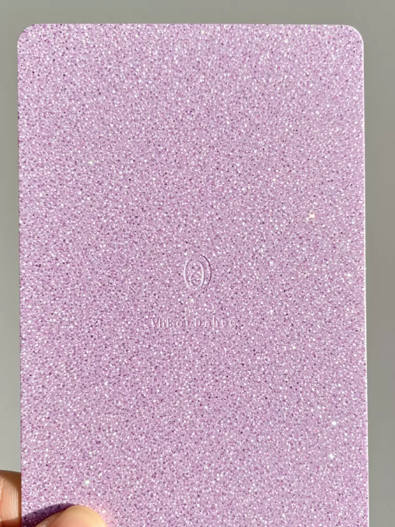
For a hint of sparkle without excess, a solid color background with tiny glitter specks is a popular choice. The album title is added in a sleek, modern font, balancing simplicity and glamour.
This design finds a sweet spot between understated and fancy, appealing to collectors who like a touch of shine. The minimalist layout ensures the focus stays on the idol’s image on the front, making it a great option for DIY creators aiming to add a bit of K-Pop charm.
5. Embossed Group Name
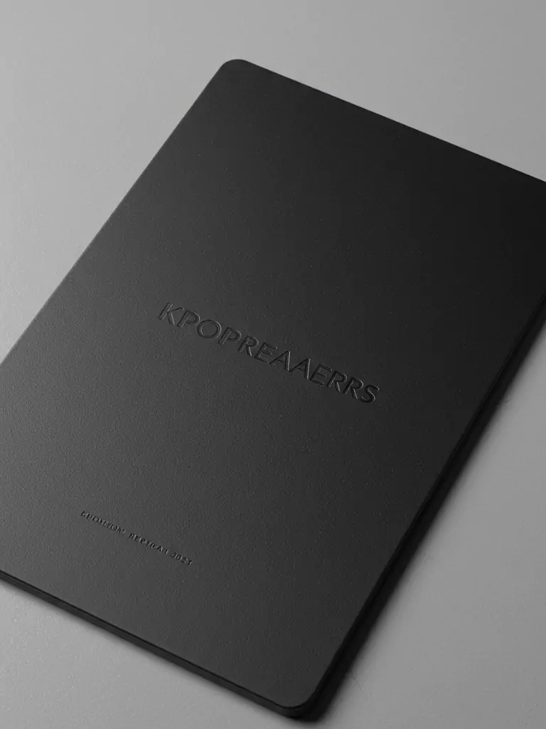
Adding an embossed group name in a metallic finish on a smooth matte background enhances a photocard’s feel. This design feels luxurious and solid when held, standing out for collectors who appreciate craftsmanship.
The contrast between the raised, shiny text and the plain background creates a refined look that suits any group, from energetic to elegant. It’s perfect for fans who want their collection to feel unique and high-quality.
6. QR Code for Exclusive Content
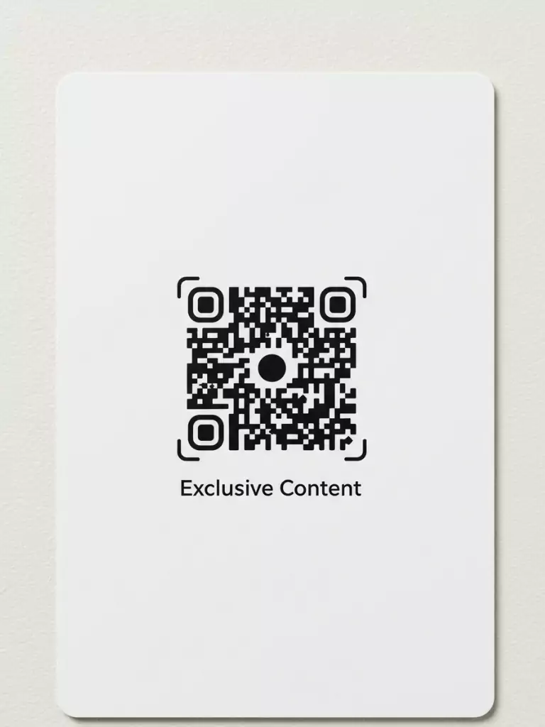
In today’s digital world, a QR code on a photocard’s back connects physical and online fan experiences. Framed by a simple border that matches the album’s theme, the QR code links to special content like behind-the-scenes videos or fan messages.
This practical yet stylish design adds excitement, turning the photocard into more than just a collectible. It’s a way for fans to engage more deeply with their favorite group.
7. Foil-Stamped Album Artwork
Turning over a photocard to reveal a piece of the album’s cover art in shiny foil stamping feels like holding a part of the album. Set against a dark background, the foil reflects light, creating a bold and luxurious effect.
This design ties the card closely to the album’s visual style, whether it’s a minimalist or colorful concept. Collectors appreciate it for its striking appearance and connection to the album’s main idea.
8. Polaroid-Style Frame
A polaroid-style border on the back adds a nostalgic charm that fans love. It includes the idol’s name in a handwritten font and a small drawing tied to the album’s theme, like a moon for a dreamy concept.
This design feels personal and easy to customize, making it a top choice for DIY creators aiming for a vintage, intimate vibe. Its simplicity makes it versatile for many groups and concepts.
9. Chibi Character Illustration
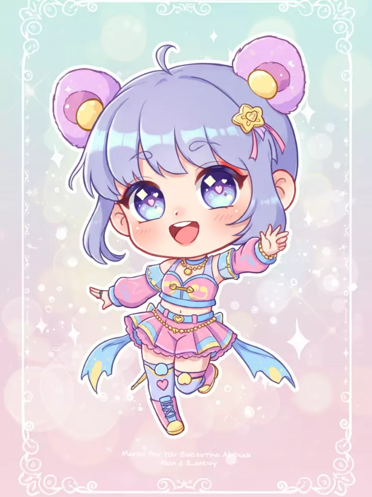
A cute, chibi-style drawing of the idol or a group mascot on the back adds joyful energy to a photocard. Paired with the album name in a playful, rounded font, this design captures K-Pop’s youthful spirit.
Fans love chibi illustrations for their fun, collectible appeal, whether it’s a tiny version of an idol or a group mascot. This design brings a charm that’s hard to resist.
10. Vintage Postcard Layout
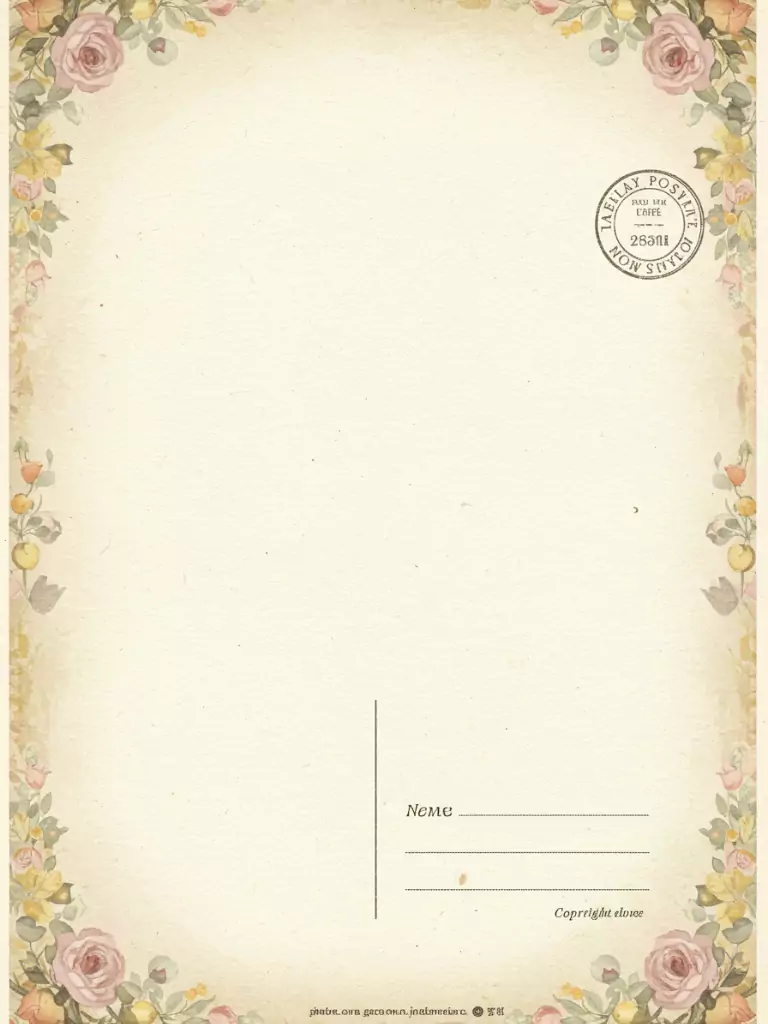
Transforming a photocard’s back into a vintage postcard with a faux stamp and handwritten-style text feels like a keepsake from another time. It includes the idol’s name and a short, warm note like “To my dearest fan.”
This design is perfect for groups with retro themes and appeals to collectors who enjoy unique, story-driven elements in their photocards.
11. Color-Blocked Geometric Shapes
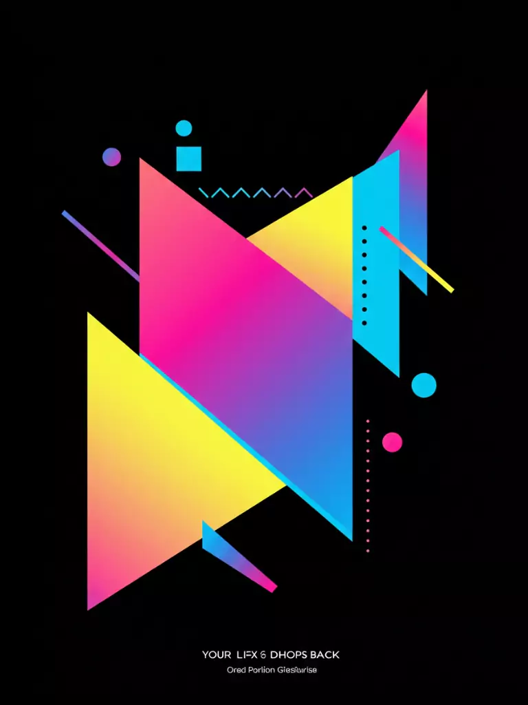
Bold geometric shapes in the album’s colors, subtly including the group’s initials, create a modern and clean back design.
This polished approach suits groups with dynamic visuals, offering a structured yet contemporary look. It’s a great choice for fans who like a graphic-focused style that stands out in a collection without being too busy.
12. Holographic Border with Lyrics
A holographic border framing a snippet of lyrics from the album’s main song adds emotional depth and visual shine.
The lyrics, written in a stylish font, tie fans to the music, while the holographic edge makes it collectible. This design resonates with fans who see photocards as part of the album’s story, perfect for groups with strong musical narratives.
13. Faux Autograph with Doodle
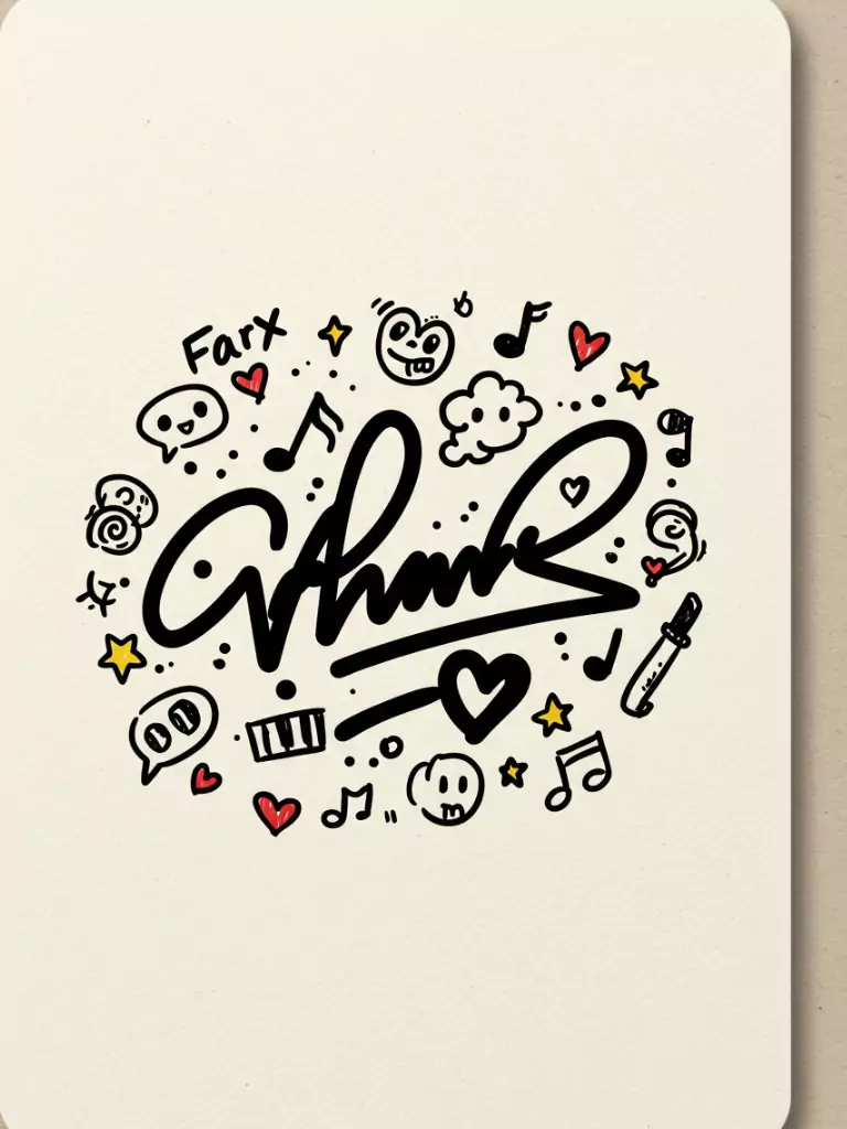
A printed autograph paired with a small, drawn-style doodle, like a heart or star linked to the idol’s personality, adds a fun and personal touch.
This design feels like a special gift from the idol, whether it’s a quirky sketch or a sleek doodle. It’s an easy way to make a photocard feel uniquely close and engaging for fans.
14. Matte Finish with Hidden Message
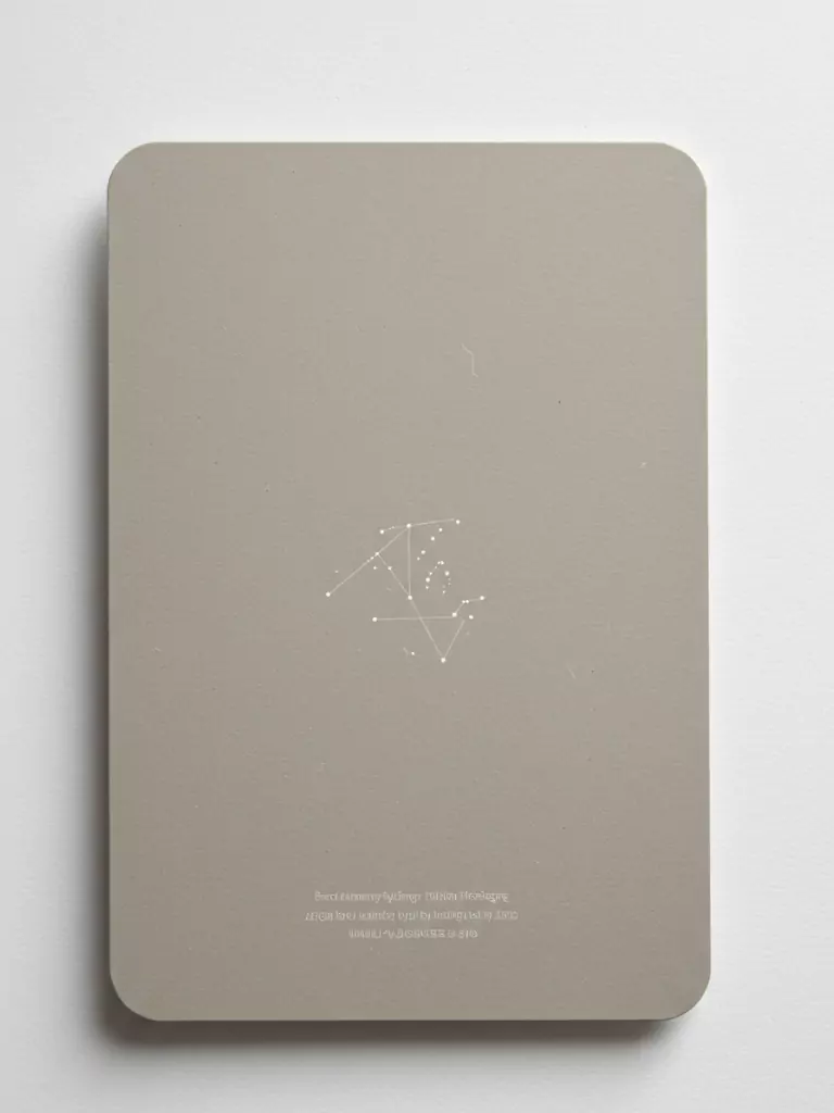
A matte background hiding a message or symbol that appears under UV light adds a clever sense of mystery.
Linked to the album’s theme, like a secret phrase, this design encourages fans to interact with their photocards in new ways. It’s ideal for collectors who love fun, hidden elements that make their cards stand out.
15. Photo Collage Background
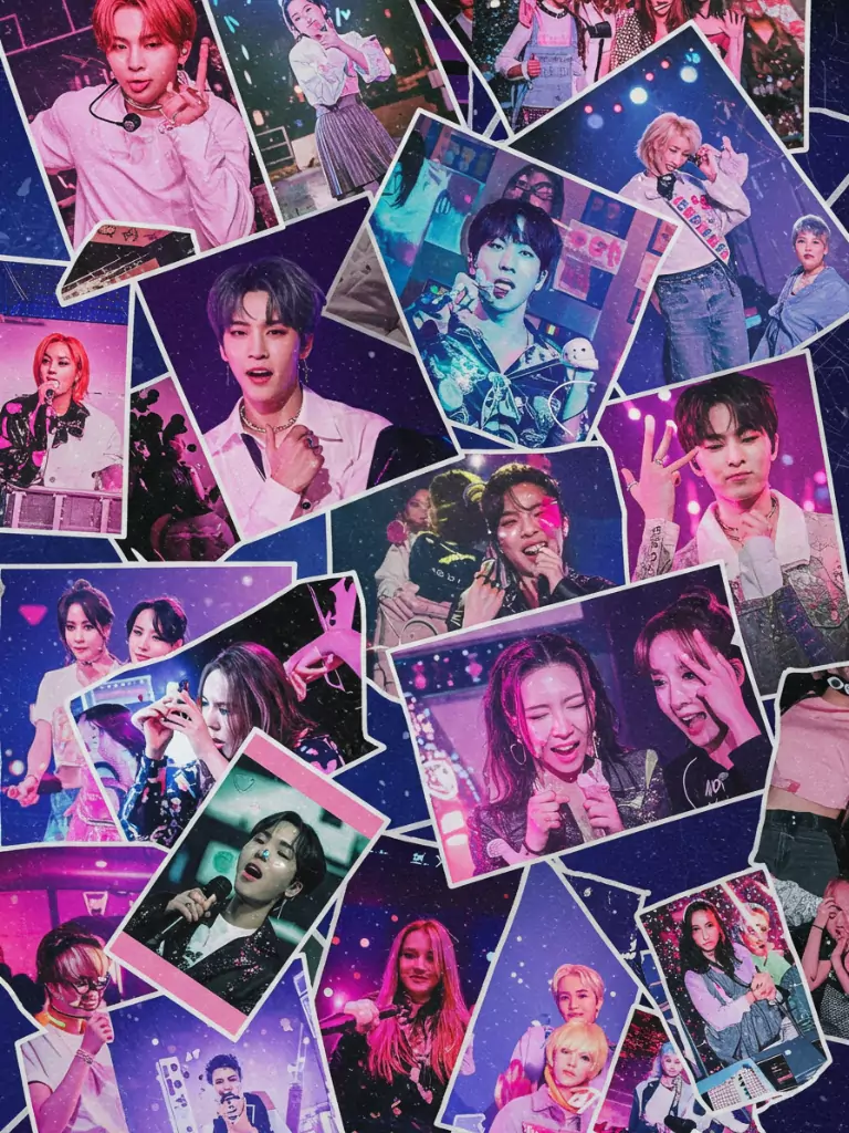
A collage of small, candid group photos in a soft, brown-toned filter, with the album title overlaid, shares the group’s journey.
This design feels like a scrapbook page, giving fans a peek behind the scenes. It’s perfect for groups whose fans cherish real moments, adding a warm, nostalgic touch to any collection.
16. Minimalist Barcode Aesthetic

A sleek barcode blended with the album’s colors and group logo creates a futuristic, practical look.
This design is both stylish and useful, suggesting authenticity or a limited-edition feel. Its clean, modern vibe appeals to fans who enjoy a simple design that still feels distinctly K-Pop.
Conclusion
These 16 K-Pop photocard back design ideas highlight why photocards are so loved in fan culture, mixing art, emotion, and purpose. From the fancy shine of foil-stamped art to the cozy charm of a polaroid frame, each design draws from popular trends and K-Pop examples to spark ideas for collectors and creators.
If you’re making your own photocards, collecting unique designs, or exploring K-Pop’s creative side, these ideas offer something for everyone. They show the variety of K-Pop styles—modern and sleek, playful and personal, or interactive and fresh. As you grow your collection or plan your next photocard, let these ideas inspire you to connect more deeply with the K-Pop world.